
Blended vs. Solid Colors in Cross Stitch: What Works?
Posted by Tracey M. Kramer on 28th Sep 2016
A Note from Tracey Kramer
I have a project in my bedroom that has been in progress for eight years. Eight. It is a blended color pattern, and I am here to tell you everything you need to know about why that number doesn't surprise me one bit.
Two cross stitch needles on fabric, one blended thread and one solid color, warm natural light
By Tracey Kramer • • 12 min read
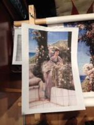
Let me tell you about a cross stitch project sitting in my bedroom right now. It is mounted in a floor stand frame, it is partially stitched, and it has been sitting there going on Year No. 8. Can you believe it? Eight years. And I want you to understand something — it is not a lack of skill that has kept me from finishing it. It is not a lack of time, not a lack of good lighting, not even a lack of interest in the finished design. It is the blended colors. Every single time I walk past that floor stand, I think about what it would take to sit down and actually make meaningful progress. I would need to untangle which blended strand goes where, fish through the palette I set up years ago, make sure all my pre-threaded needles are still in order, and then — maybe — put in an hour of actual stitching. The barrier to entry is just high enough that I find myself with zero incentive to gingerly hop up in that chair and get after it with a smile on my face. When I do eventually finish that project, it will be a genuine accomplishment. Something I should have finished a long time ago.
Now, I am not telling you that blended colors are wrong or that you should never touch them. This craft is deeply personal, and what works for one stitcher drives another one to the storage closet. What I am telling you is that after thirty-plus years of stitching, I have strong opinions backed by real experience. And if you are trying to decide whether a blended color pattern or a solid color pattern is the right choice for your next project — or your next purchase — I want to give you the full, honest picture. Not a watered-down comparison, but a real look at what each approach costs you in time, materials, and mental energy, and what each one gives back to you in the finished piece.
We are going to cover the three main blending techniques stitchers use, talk about how many colors a pattern actually needs to look realistic, and make the case — firmly but fairly — for why solid color patterns done right can be every bit as stunning as their blended counterparts. I design every Sunrays Creations pattern around that principle. So let's dig in.
The Three Blending Techniques: What They Are and How They Work
Before you can make an informed choice about blended versus solid colors, you need to understand what stitchers actually mean when they say 'blending.' It is not one single technique. There are at least three distinct approaches, and they vary considerably in complexity, visual effect, and how much setup time they demand from you before you ever make a single stitch.
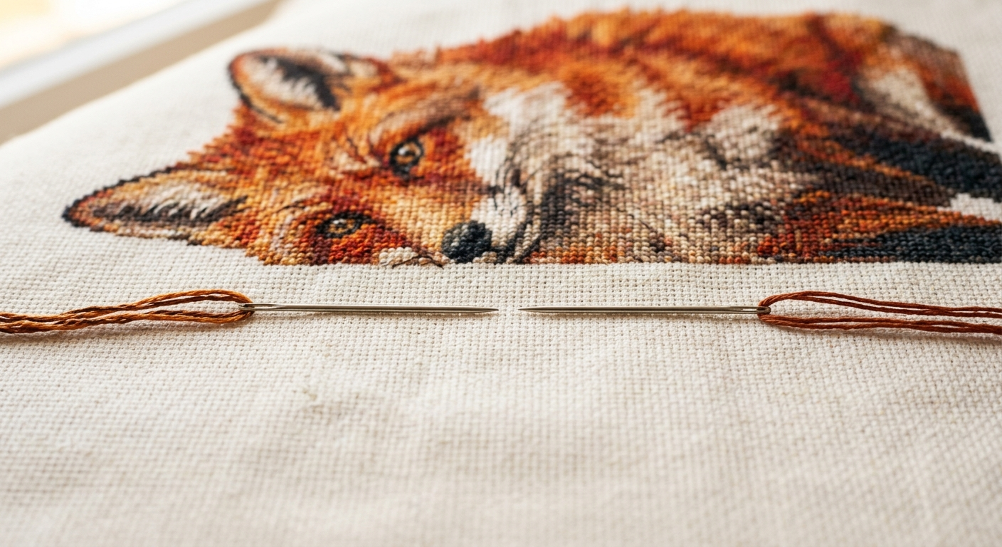
The first technique — and the one most people mean when they say blended colors — is called blending or tweeding. This is the process of threading one strand of Color A and one strand of Color B on the same needle at the same time. As you stitch, those two strands twist together naturally. From a normal viewing distance, your eye merges the two colors into what appears to be a third, intermediate shade — one that doesn't actually exist as a single DMC number. This technique works best when the two colors are close in value, meaning they are neighbors on the color wheel or very similar in light and dark level. Thread colors that are too far apart in value can look muddy or visually chaotic rather than blended. The results, when done well, can be genuinely beautiful. The problem is the logistics, which I will get into shortly.
The second technique is called dithering, and it operates at the chart level rather than in the needle. Instead of blending two colors on a single needle, the chart designer alternates individual whole stitches of two different colors in a checkerboard-like pattern along a color boundary. From a distance, your eye reads the two alternating colors as a single blended tone — an optical illusion built right into the design. Dithering is clever. It requires no special needle threading, but it does demand very careful chart reading and color discipline as you stitch, because every single stitch placement matters for the illusion to hold.
The third option is DMC Color Variations floss (find on Amazon), which is a commercially available variegated thread that shifts through a range of related colors every five to seven stitches along the skein. You thread it like any other floss, stitch normally, and the built-in color transitions do the blending work for you — no technique overhead required. There is even an DMC Anniversary Collection (find on Amazon) that features specialty and variegated colorways worth exploring if you want that blended look without the setup. For certain project types — water, sky gradients, foliage — Color Variations can deliver a painterly quality that is genuinely hard to replicate with straight solid colors. That said, it comes with its own limitations: you give up precise color control, and the shifts are not always predictable relative to your chart.
So there is the landscape. Blending by needle, dithering by chart, and variegated floss by skein. Each one is a legitimate tool. Each one adds complexity. And none of them — in my experience — are necessary to produce a finished piece that looks rich, detailed, and alive. Not when you have enough solid colors in your palette to begin with.
The Real Cost of Blended Color Work: Time, Sanity, and Setup
Let me paint you the picture of what blended color work actually looks like in practice, because the pattern cover never tells you this part. When a pattern calls for blended threads, it is not simply a matter of grabbing two skeins and starting. To work efficiently — and without losing your mind stitch by stitch — you have to sit down before you begin and build yourself a palette. This means separating individual strands from every blended color combination called for in the pattern, pairing them correctly, and pre-threading multiple needles so you can switch between blend combinations without re-threading every few minutes.
If a pattern calls for, say, twelve distinct blended combinations on top of its solid colors, you are looking at a meaningful chunk of prep time before your needle ever touches the fabric. And the needles themselves become a project within the project. You need to keep them organized, labeled if possible, and protected from tangling. A good embroidery floss organizer (find on Amazon) helps enormously here — without one, your pre-threaded needles turn into a small chaos pile in a hurry. Even with great organization habits, blended work introduces friction at every session. You sit down, you re-orient yourself to which needle holds which blend, you find your place on the chart, and then you stitch. It slows the entire rhythm of the work.
That rhythm matters more than people give it credit for. One of the quiet joys of cross stitch — the thing that makes it genuinely restful rather than stressful — is the meditative quality of it. Pull thread, form the stitch, move on. When you introduce the cognitive overhead of managing multiple blends simultaneously, that meditative flow breaks. You are no longer just stitching; you are project-managing. For some people, that level of engagement is exactly what they want. They find the complexity satisfying. I respect that completely. But for me, and for many of the stitchers who come to Sunrays Creations, the goal is a beautiful finished piece achieved in a reasonable amount of time with a process that feels enjoyable rather than like homework.
There is also the question of the double-eye cross stitch needle (find on Amazon) — a specialty needle with two eyes that some stitchers use for blending, threading one color through each eye so the strands feed together cleanly. It is a thoughtful tool that genuinely reduces some of the threading frustration. But the existence of specialty needles designed specifically to make blending easier tells you something about how much friction the technique introduces in the first place. Good tools help. They do not eliminate the overhead.
Tracey Recommends
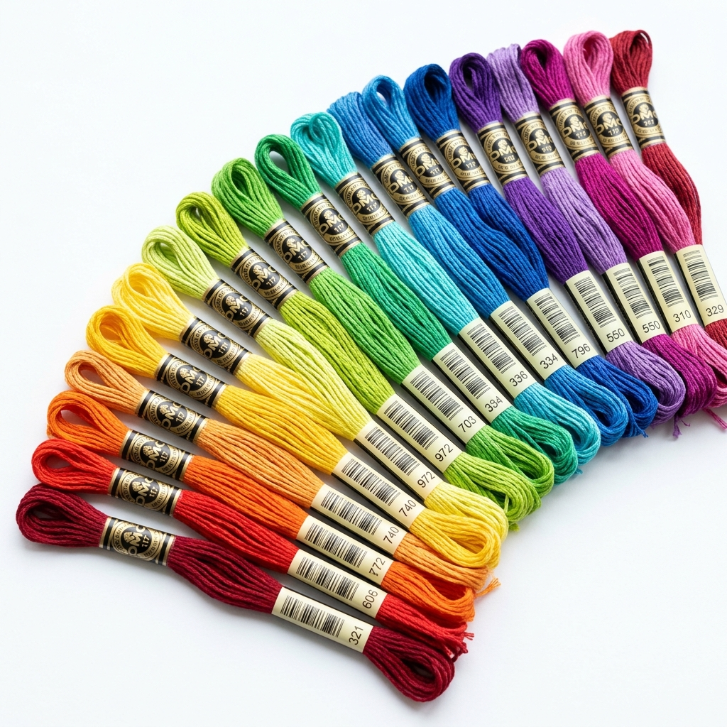
DMC 100-Color Embroidery Floss Assortment
If you are going to stitch photorealistically without blending, you need a real palette — not the twelve colors that came in a beginner kit. A 100-color DMC assortment gives you the range to capture realistic gradients, lifelike skin tones, and the kind of color depth that makes people stop and look twice at your finished piece. This is the foundation investment that makes the solid-color approach work at its best.
See on AmazonYou do not have to sacrifice beauty for efficiency. You just have to design — and stitch — with intention. Every piece in that gallery was stitched in solid colors only. Does it look like anything is missing?
How Many Colors Does a Realistic Cross Stitch Pattern Actually Need?
Here is where I want to push back on an assumption that I hear fairly often: the idea that a blended color pattern automatically looks more realistic than a solid color pattern. That assumption conflates two separate things — the number of distinct color transitions in a design and the technique used to achieve them. Realism in cross stitch comes from having enough colors. The technique used to manage those colors is secondary.
Think of it in tiers. A pattern using somewhere between 10 and 15 colors is going to have a stylized, graphic quality to it. Think bold, simplified shapes. Clean. Sometimes intentionally retro. Beautiful in its own right, but not photorealistic. This is a great range for beginners and for designs that are meant to be decorative rather than representational.
Move up to the 15 to 30 color range and your subjects become recognizable with real depth. You can capture a cardinal on a branch, a simple floral arrangement, a child's face in soft focus. This is a solid beginner-to-intermediate range where most stitchers feel confident and where the work moves at a satisfying pace. Most of the holiday and botanical designs I chart fall somewhere in this territory.
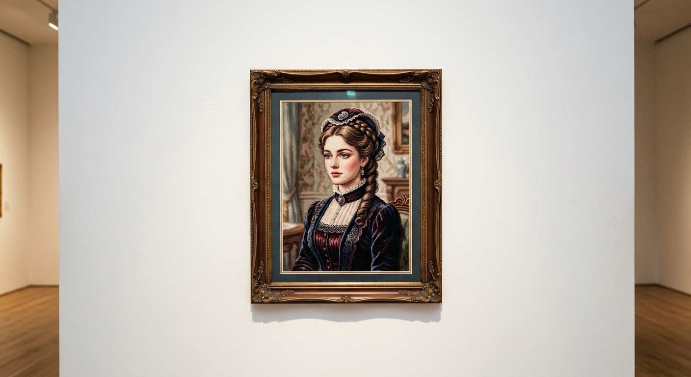
The 30 to 50 color range is where photorealism begins in earnest. Landscapes, animal portraits, architectural details — these are the designs where a viewer stops and looks twice because the finished piece has the density of color information that the human eye expects from a photograph or a painting. My more complex animal and Victorian portrait patterns live in this range. Every color earns its place on the chart, and the result is a finished piece that genuinely stops people in their tracks.
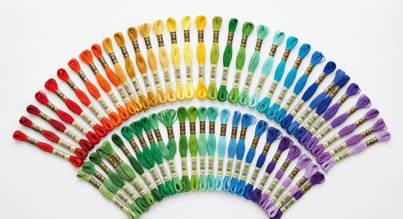
Beyond 50 colors — up into the 50 to 100 color territory — you are in hyper-detailed, high-commitment design space. These patterns can be extraordinary. They can also become genuinely difficult to work from because chart readability starts to suffer. When symbols on a chart become too similar to distinguish at a glance, you spend more time squinting at the key than stitching. That is a practical ceiling, and any designer worth her salt knows it. The goal is always to use exactly as many colors as the design needs — no more, no fewer. At Sunrays, I consistently use more colors than the average pattern on the market specifically because I refuse to compromise on the richness of the finished piece. And every single one of those colors is a solid.
Fifty DMC embroidery floss skeins arranged in full color gradient fan on white surface
Solid Colors Done Right: The Sunrays Approach
When I started designing patterns for Sunrays Creations back in 2004, this question — blended or solid — was something I thought through carefully. My answer has not changed in twenty years. Every pattern I chart uses solid colors only, and every pattern I chart uses a generous number of them. That combination is the foundation of everything we do here.
The argument for solid colors is simple: if you have enough of them, you do not need blending. The eye does the interpolation work naturally when the color transitions on the chart are tight enough. A shadow on a horse's flank that moves from deep brown to warm chestnut to pale gold does not need blended threads if those three transitions are supported by two or three intermediate solid colors bridging them. The gradient is already there. You just have to chart it that way. It takes more work on the design side — more time spent at the lightbox building the color key, more decisions about which DMC numbers to include — but the stitcher gets to pick up the needle and work in clean, efficient stitches from start to finish.
The practical benefit for you as a stitcher is enormous. No pre-threading palettes. No needle management. No cognitive overhead switching between blend combinations. You finish one color section, cut your thread, start the next. The work moves. I have watched stitchers complete solid color Sunrays patterns in timeframes that genuinely surprised them — not because the patterns are simple, but because the process is streamlined. Compare that to my eight-year floor stand situation, and I think the case makes itself.
If you are building your floss collection to stitch photorealistically without blending, you need a real, comprehensive palette. This is exactly why I recommend investing in a DMC 100-color embroidery floss assortment as a foundation — not because you will use every color in every project, but because having the right color already in your kit when you sit down to stitch is one less obstacle between you and a finished piece. The more-colors-more-realism argument only holds if you actually have the colors available.
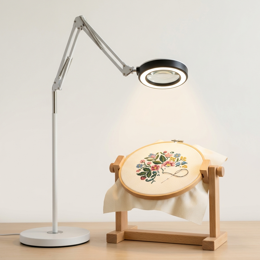
And one more practical note: when you are working with 40 or 50 closely related DMC colors in a single project, distinguishing between neighbors like DMC 3752 and 3753 — colors that are genuinely very close — requires good light. A proper daylight LED magnifier lamp is not a luxury at this level of work. It is the tool that makes the difference between placing the right color and placing the wrong one and not realizing it until ten rows later. Good lighting is one of those investments that pays for itself the first time it saves you from a major frogging session. And speaking of frogging — if you have never heard the term or want a refresher on how to handle it gracefully, I cover it thoroughly over at What Is Frogging in Cross Stitch.
|
Patterns from the Sunrays Collection Tracey's Picks, designing cross stitch patterns since 2004 |
|||||
|
|||||
| Browse the full Sunrays collection → |

See the Proof: The Sunrays Works in Progress and Finished Gallery
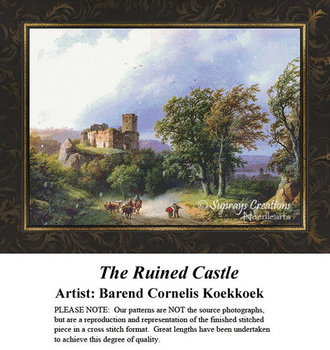
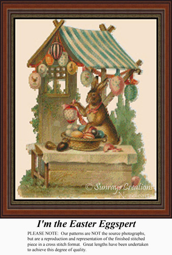
I can tell you all day long that solid color patterns produce stunning, photorealistic results. What I would rather do is show you. Every single piece in the Sunrays Works in Progress and Finished Works gallery was stitched using solid colors only. No blending. No tweeding. No dithering. Just clean, solid DMC floss in carefully chosen color combinations, one stitch at a time. Open that page and look at the depth of the animal portraits. Look at the way light moves across a floral design. Look at the skin tones in the Victorian portraits. Does anything look flat? Does anything look like it's missing a blended thread? I will let the gallery answer that question for you.
This is not an accident of particularly talented stitchers doing something extraordinary with average patterns. These results come directly from the design philosophy baked into every Sunrays chart: use enough colors, choose them precisely, and the finished piece will have the vibrancy and realism that stitchers are chasing when they turn to blended patterns in the first place. The difference is that a Sunrays pattern gets you there without the eight-year floor stand situation.
I hear from customers regularly who switched to Sunrays patterns after struggling to finish blended color designs from other sources. The feedback is almost always the same: the work moves faster, the process feels more enjoyable, and the finished piece looks as good as — or better than — what they were chasing with the blended approach. That feedback means more to me than almost anything, because it confirms what I have believed since I charted my first design: you do not have to sacrifice beauty for efficiency. You just have to design — and stitch — with intention.
Get Stitching Tips & New Patterns from Tracey
Honest advice, new Sunrays designs, and occasional VIP-only offers. No fluff.
No spam. Unsubscribe any time.
Tracey Recommends
Daylight LED Magnifier Lamp for Cross Stitch
When your pattern uses 40 or 50 carefully chosen DMC colors and two of them are DMC 3752 and 3753 — colors so close in value that the naked eye under incandescent light cannot reliably tell them apart — proper daylight lighting is not optional. An OttLite-style daylight LED magnifier lamp eliminates color-matching guesswork, reduces eye strain during long sessions, and saves you from the heartbreak of placing the wrong color and not catching it until much later.
See on AmazonMaking the Choice That Is Right for You
Here is where I will say what I said at the start: to each his own. I mean that genuinely. There are stitchers who find the process of building a blended palette and managing a dozen pre-threaded needles deeply satisfying. The complexity is part of the appeal for them. The methodical nature of it, the precision it demands — that is their version of the meditative flow that I find in solid color work. And the results they achieve can be extraordinary. I am not here to take that away from anyone.
What I am pushing back against is the assumption — sometimes stated, sometimes implied by the pattern market — that blended colors are inherently more sophisticated or more beautiful than solid colors. That is simply not true. Sophistication in cross stitch comes from intentional design, careful color selection, and skilled execution. Those things are available in both approaches. What blended work adds is complexity. Whether complexity serves your goals or works against them depends entirely on who you are as a stitcher and what you want your craft time to feel like.
If you are someone who starts projects and struggles to finish them — and most of us have at least one unfinished piece haunting us from a closet shelf or a floor stand — I would ask you to think honestly about what is keeping you from finishing. If the answer involves any version of 'it is too complicated to pick back up,' solid color patterns are worth a serious look. Not as a compromise. As a better tool for how you actually stitch.
When you are ready to explore what that looks like in practice, I would encourage you to start with What Do You Need to Cross Stitch if you are building your supplies, or head straight to the Sunrays shop and browse the pattern catalog. Every pattern listed there was designed with the same commitment: enough colors to make it real, all of them solid, and a process designed to let you actually finish what you start. God willing, before year eight.
Thirty years of stitching has taught me that the best project is the one you actually finish — and the best pattern is the one that makes you want to sit down and work on it tonight, not the one gathering dust on a floor stand. If you are ready to see what solid colors done right can do, come browse the Sunrays Creations pattern shop. Every design is hand-charted, loaded with color, and built to be finished in this lifetime.
Framed photorealistic Victorian cross stitch portrait on white gallery wall with warm soft lighting
Keep Reading
What Do You Need to Cross Stitch?
Building your supplies from scratch or filling in the gaps? This guide covers everything you need to get started and stitch well.
READ THE GUIDEWhat Is Frogging in Cross Stitch?
Placed the wrong color and need to undo it? Learn what frogging means, how to do it without damaging your fabric, and how to recover cleanly.
READ THE ARTICLECross Stitch FAQs
From thread counts to frame types to finishing options — the questions stitchers ask most, answered directly.
READ THE GUIDEFrequently Asked Questions
What is the difference between blended and solid colors in cross stitch?
Blended colors involve threading two different-colored strands on the same needle so they merge visually as you stitch. Solid colors use matching strands throughout. See the technique breakdown earlier in this article for full detail.
What is tweeding in cross stitch?
Tweeding is another name for needle-blending — threading one strand of two different colors together on a single needle. The body section on blending techniques covers this alongside dithering and DMC Color Variations.
Do blended colors look more realistic than solid colors in cross stitch?
Not necessarily. As covered in the color-count section, realism comes from using enough solid colors with tight transitions — not from blending technique. The Sunrays gallery is proof.
How many colors does a photorealistic cross stitch pattern need?
Generally 30 to 50 colors for photorealistic results. The article covers four distinct tiers from 10-color graphic designs up to 100-color hyper-detailed work.
Why do blended color cross stitch projects take so long to finish?
Blended work requires palette setup, pre-threaded needle management, and constant color-switching that breaks stitching rhythm. Tracey's eight-year floor stand project is a vivid real-world example of this overhead.
What is DMC Color Variations floss and is it worth using?
It is a variegated thread that shifts color every five to seven stitches, delivering a built-in blend without technique overhead. The article covers it as a third option alongside needle-blending and dithering, with notes on where it works best.
-- Tracey Kramer
Founder & Designer, Sunrays Creations Needlearts
Hand-charted designs since 2004 • Marysville, Ohio