Cross Stitch Fabric Color & Count: How to Choose
Posted by Tracey M. Kramer on 4th Jun 2020
A Note from Tracey Kramer
I have been choosing fabric for cross stitch projects for over thirty years, and I still think it is one of the most underrated decisions a stitcher makes. This one is close to my heart.

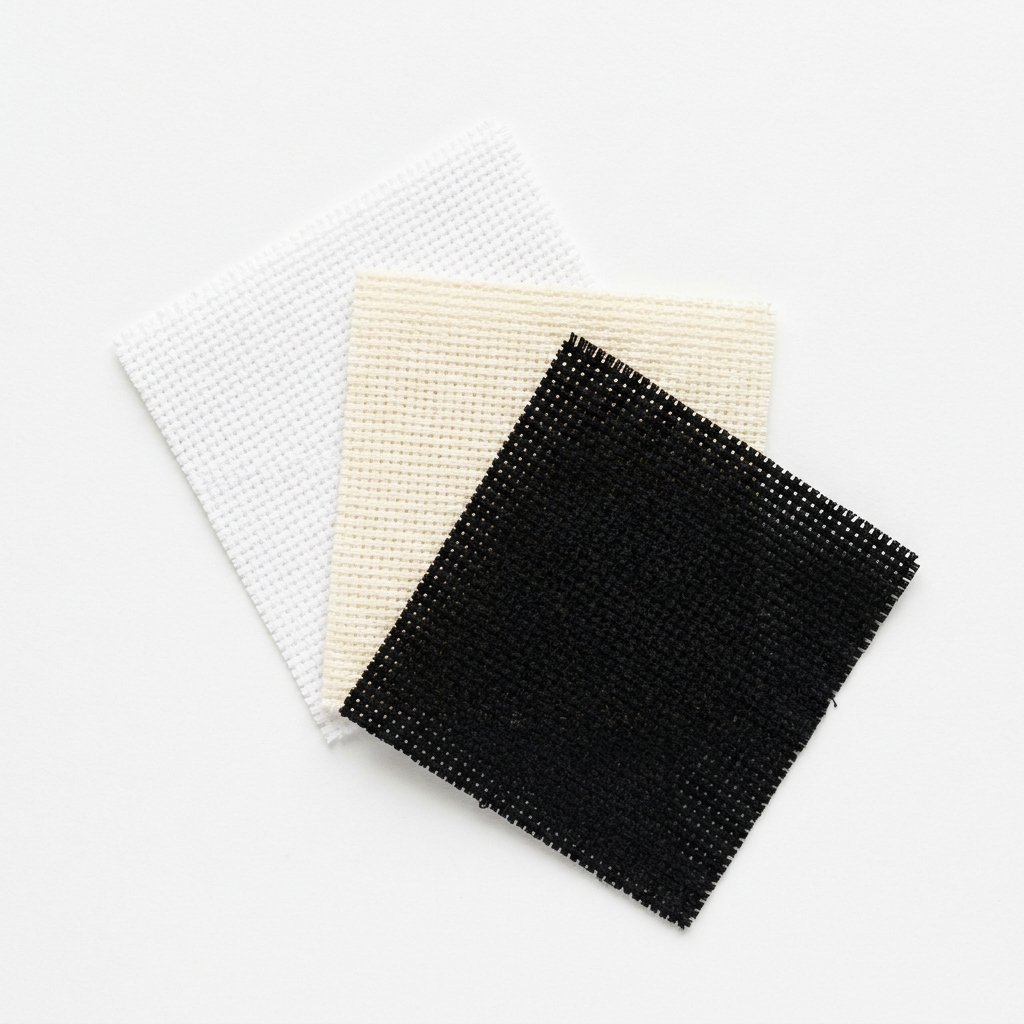
Three pieces of Aida cloth in white, cream, and black with matching floral cross stitch, showing fabric color contrast
By Tracey Kramer • • 12 min read
Here is something I notice all the time when stitchers are starting a new project: they reach for white Aida without a second thought. White 14-count, right off the shelf, every single time. And honestly? For a lot of projects that is exactly the right call. White Aida is a workhorse. It is widely available, easy to see, forgiving to work on, and it looks clean and bright when you are finished. I am not here to talk you out of it. But I am here to tell you that it should be a decision, not a reflex — because when you make it deliberately, even if you end up choosing white 14-count anyway, you are going to understand your finished piece better and feel more confident about it.
What I want to talk about in this article is the two fabric choices that trip stitchers up the most, and that nobody really explains in plain terms when you are starting out. The first is color. What background color should you choose for your specific design? The second is count. What stitch count suits your eyes, your patience, and the level of detail your pattern requires? These are two completely separate decisions, and both of them matter. Get them right and your finished piece will feel intentional and polished. Get them wrong and you will spend the whole project fighting the fabric instead of enjoying it.
I have been designing and stitching original counted cross stitch patterns since 2004, and I have been stitching for well over thirty years. In that time I have worked on white, cream, antique, black, navy, green, and everything in between. I have stitched large fine-art portraits on 18-count Aida and tiny ornaments on 28-count evenweave. Every one of those projects taught me something. What follows is what I actually know — not theory, not what the books say, but what I have figured out by doing it.
Your Fabric Is a Canvas — and Color Is a Choice
When you think about a painting, you think about the paint — the colors, the brushstrokes, the composition. But a painter also thinks about the ground: the canvas itself, whether it is primed white or toned with a warm grey or a neutral beige. That ground color affects everything that goes on top of it. Cross stitch fabric works exactly the same way. The background color you choose is not neutral. It participates in the finished piece. It sets the mood, affects how thread colors read, and tells the viewer something about the character of the work before they even look closely at the stitching.
Most stitchers never think about this because the default is so entrenched. White Aida is what is stocked at every craft store, what is shown in every beginner kit, what is assumed in most pattern instructions. So it becomes invisible as a choice — it just is. And that is fine until you start asking yourself why a finished piece does not look quite as striking as you imagined it would. Sometimes the answer is not the thread colors or the tension or the framing. Sometimes it is simply that the background color was wrong for the design.
Over the years I have experimented with a lot of different fabrics. White, cream, antique white, black, navy, soft green, pale blue. Each one changes the character of the finished work in ways that are genuinely surprising until you have seen them side by side. A botanical design that looks pleasant on white looks absolutely luminous on cream. A floral portrait that feels a little flat on white looks like a painting you would find in a Victorian parlor on black. These are not small differences. They are the difference between a nice piece and a piece that stops people in their tracks. So before we talk about count, let us talk about color — because it is the more interesting decision, and the one most people skip entirely.
White and Cream Aida: The Classic Choices
White Aida earns its place as the default for a reason. It provides maximum contrast with the widest range of thread colors, which makes your stitching legible and bright. If you are working with dark threads — navy, forest green, deep burgundy, black — white background makes them punch hard. If you are working with a design that has a lot of color variety and you want every shade to read clearly and crisply, white is your safest choice. It is also the easiest fabric to see the holes in, which matters more than people realize. When you are tired or working in less-than-ideal light, that visibility can be the difference between enjoying your session and dreading it.
Cream and antique white are a softer alternative, and I reach for them more often than people might expect. They are not dramatically different from white in terms of contrast — dark threads still read well against them — but they change the emotional temperature of the finished piece. Cream softens the look. It gives the work a warmer, slightly aged quality that suits certain designs beautifully. Samplers, botanical studies, historical-style alphabet pieces, anything with a heritage or cottage feel — these almost always look better on cream or antique than on bright white. White can make those designs feel a little sterile, a little clinical. Cream gives them the right warmth.
Here is my practical test when I am deciding between white and cream: I pull out a length of the dominant thread colors in my chart — the ones that will cover the most ground in the finished piece — and I hold them against both fabrics in good daylight. Not indoor lamplight, actual daylight or a daylight-balanced lamp. And I look. Which one makes the thread color sing? Which one makes it look muddy or washed out? That test takes two minutes and it has saved me from making the wrong choice more times than I can count. If you are ever unsure, do this before you buy your fabric. The answer is usually obvious once you see it.
Tracey Recommends
14-Count Aida Cloth Pack — Multiple Colors
The most practical way to experiment with fabric color without committing to a full roll. A multicolor Aida pack gives you white, cream, black, and a range of colors so you can see exactly how your thread shades read against each one before you start a full project. I genuinely recommend trying at least two background colors before you decide — the difference is always surprising, and you cannot unsee it once you have seen it.
See on AmazonI tend to think that flowers look really lovely when stitched against a black background. It gives the image a rich tapestry-like finish — and your eye goes to it first every single time.
Dark and Colored Aida: When the Background Becomes Part of the Design
This is where it gets genuinely exciting, and where I think a lot of stitchers are missing out by sticking to white out of habit. Dark fabric — black, navy, deep burgundy — does something that white simply cannot do: it makes bright colors leap forward with an intensity that feels almost three-dimensional. I tend to think that flowers look really lovely when stitched against a black background. It gives the image a rich tapestry-like finish. That is not just my preference talking — there is real visual psychology behind it.
If you look at a bouquet of flowers against a white or light background compared to a dark or black background, your eye tends to go to the black background picture first and it will dominate your perception as to what is pleasing to the eye. Saturated reds, vivid pinks, bright yellows, rich golds — all of these colors register with more intensity against black than they ever could against white. The white background diffuses the visual energy. The black background focuses it. The result on black looks less like a counted cross stitch project and more like a painting, or a piece of fine embroidery you would find framed in an antique shop. It commands attention in a way that the same design on white simply does not.
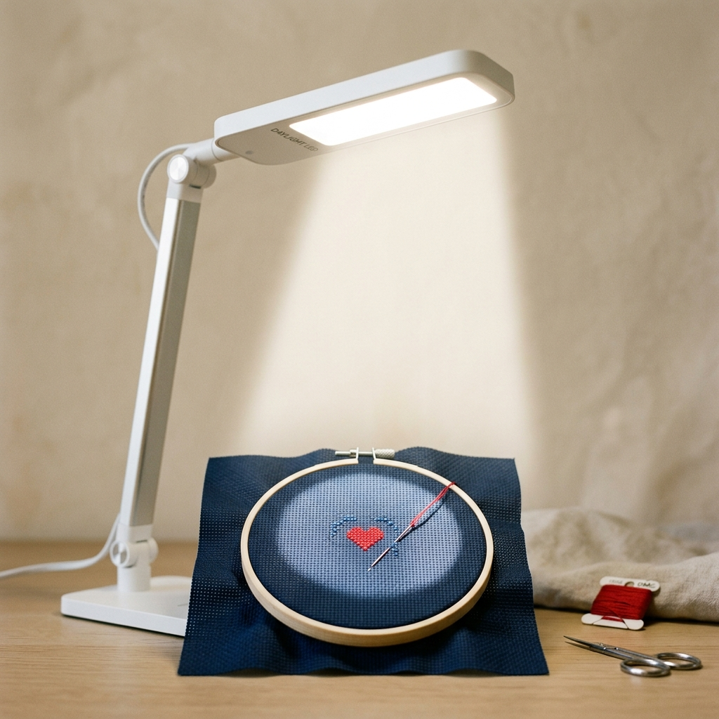
That said, dark fabric requires some practical adjustments and I want to be upfront about that. The biggest one is lighting. Standard indoor lighting is not sufficient for stitching on black or navy Aida — the holes simply disappear into the fabric and you will spend more time hunting for them than actually stitching. You need a true daylight lamp, the kind that replicates natural sunlight, and you need it positioned well. I also recommend a light box or backlit stand for the densest sections of a design where the holes are truly hard to locate. These are not dealbreakers — they are just part of working with dark fabric. If you are curious about the specifics of how to set yourself up for success on dark cloth, I have a whole companion guide on exactly that: tips for stitching on dark Aida.
Colored Aida that is not quite as dramatic as black is also worth considering. Soft blue, sage green, pale gold, rich burgundy — these backgrounds add personality to a design without the full challenge of stitching on black. For seasonal and holiday pieces especially, colored Aida can be striking. A Christmas design on deep red or forest green Aida feels completely different from the same design on white — more festive, more intentional, more like a finished decorative piece and less like a counted project. These colors are widely available and more forgiving to work on than black, so they are a great stepping stone if you are curious about moving away from white but not quite ready to go all the way to dark fabric.
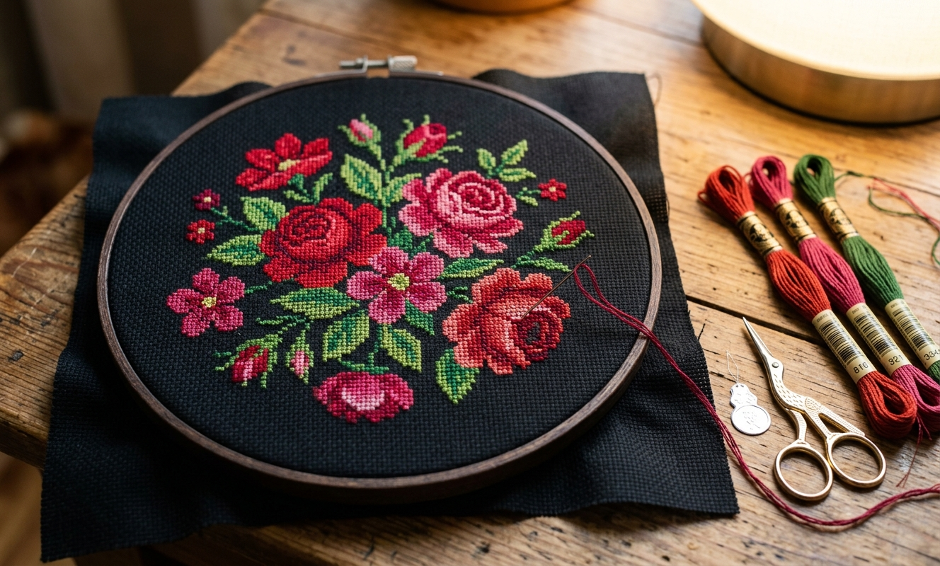
Floral cross stitch in progress on black Aida cloth, red and pink blooms against dark background with vivid contrast
Count: Matching the Fabric to Your Eyes and Your Project
Count is the other half of the fabric decision, and it is misunderstood more than people realize. The count simply tells you how many stitches fit in one inch of fabric. That is all it is. A 14-count Aida has 14 stitches per inch. An 18-count has 18. A 28-count evenweave has 28. Lower count means bigger individual stitches, which means easier to see, easier to place the needle, and more forgiving of slight tension inconsistencies. Higher count means smaller stitches, more detail possible in a given space, but significantly harder on your eyes and your patience. Understanding this helps you match the fabric to the project and to yourself — and that is what matters.
My honest position, after more than thirty years of stitching: I often prefer 18-count Aida. It is my sweet spot. It gives me the detail I love — fine-art images, botanical portraits, Victorian subjects — without the eye strain and the frustration of working very small. I can work on it for a long session without feeling like I need to lie down afterward. But I did not start on 18-count. I worked my way there over years of experience, and I think that trajectory matters. If you are a beginner, 14-count is where you should start. It is neither too large nor too small — it is genuinely the sweet spot for learning, because you can see the holes clearly, place your needle accurately, and develop your tension and rhythm without fighting the fabric every step of the way. For a deeper dive into what else you need when you are just starting out, this beginner supplies guide walks through everything.
Once you are comfortable on 14-count and you want more detail in your finished work, moving to 18-count is a natural next step. The holes are smaller and you will need better light — this is another reason a daylight lamp is worth the investment — but the results are beautiful. Above 18-count, you are really in specialty territory. 28-count and higher is not something I would recommend unless you have excellent lighting, magnification, and a specific reason the finer detail is worth it. The stitching is rewarding when you get there, but it is genuinely demanding. Do not let anyone make you feel like you should be on 28-count linen if 14-count Aida is what you enjoy. That kind of fabric snobbery has no place in this craft.
Here is a practical tip I want you to tuck away, because it has saved me more than once. If you have a piece of Aida in your stash with no label and you cannot remember what count it is, here is what you do: take a ruler, a magnifying glass, and a blunt needle and place the ruler flat on the fabric. Using the magnifying glass to see clearly, take the blunt needle and count how many holes — or stitches — fall within the one-inch mark on the ruler. If you count 14, it is 14-count. If you count 18, it is 18-count. Simple as that. You will never need to guess again. I also find that a needle minder magnet (find on Amazon) is genuinely useful when you are doing this kind of up-close work — it keeps your needle from wandering while your hands are occupied with the ruler and magnifier. And if you are working with anything finer than 14-count, a cross stitch embroidery hoop (find on Amazon) that holds your fabric taut will help you see the holes much more easily and stitch more consistently. Good tension in the hoop makes a real difference to both visibility and the evenness of your finished stitches. A pair of sharp cross stitch fabric scissors (find on Amazon) is also worth having on hand when you are cutting fabric to size — clean cuts prevent fraying and make the whole setup feel more professional from the start.
|
Patterns from the Sunrays Collection Tracey's Picks, designing cross stitch patterns since 2004 |
|||||
|
|||||
| Browse the full Sunrays collection → |


Putting It Together: How to Choose Before You Start
Here is the decision framework I actually use, and I think it is simple enough that any stitcher can apply it before they buy a single yard of fabric. First, look at the dominant thread colors in your chart. If they are bright and saturated — vivid reds, clear blues, warm golds — you have a real case for dark or colored Aida. Those colors will reward the contrast. If they are muted, soft, or pastel — dusty roses, sage greens, soft creams — white or cream Aida will serve them better. Dark fabric tends to make muted colors look muddy rather than rich. Match the fabric to the energy of the threads, not to the default.
Second, think about the finished piece's purpose and where it is going to live. A gift that will be framed and hung in someone's home? Think about the room — the wall color, the furniture, the general aesthetic — and choose a fabric that will complement it. A sampler meant to look vintage and handmade? Cream or antique is almost always right. A floral portrait you want to stop people in their tracks and make them ask who made it? Black. And please remember: there is no shame in stitching on Aida regardless of which color you choose. I have stitched many a pattern — large ones, fine art images — and the finished project has come out looking just as stately as any project done on evenweave. The fabric snobbery you sometimes encounter in cross stitch circles is completely unfounded. Use what you love and work well with. The quality of a finished piece comes from the stitcher's care and patience, not from the fabric label. For more on this, the cross stitch FAQs address a lot of the common misconceptions beginners run into.
Third, choose your count based on your eyes and your experience level, not on convention or what someone else thinks you should be using. Start with 14-count unless you have a specific reason to go otherwise. Move up when you feel ready and when the design calls for it. Use good light always — but especially on anything above 14-count and on any dark or colored fabric. Once you have made these two decisions deliberately — color and count — the rest of your project setup falls into place more easily. And when you browse the pattern collection at Sunrays Creations, I want you to look at each design and ask yourself: what would this look like on black? On cream? On a soft blue? The designs are tested across multiple fabric colors, and the right background can take a design you like and turn it into a finished piece you absolutely love. That is worth the extra five minutes of thought before you start.
Get Stitching Tips & New Patterns from Tracey
Honest advice, new Sunrays designs, and occasional VIP-only offers. No fluff.
No spam. Unsubscribe any time.
Tracey Recommends
OttLite LED Daylight Craft Lamp
A daylight lamp is non-negotiable once you start stitching on dark or colored fabric. Standard indoor lighting washes out the holes in navy or black Aida and makes them nearly impossible to find. A true-daylight OttLite brings every hole into crisp focus and transforms the experience of working on dark cloth. It also helps enormously with any count above 18. I consider this one of the most important tools in my stitching setup.
See on AmazonFabric color and count are two of the most important decisions you make before a project begins, and they are worth making deliberately every single time. I hope this helps you feel more confident the next time you are standing in front of a stack of Aida or scrolling through fabric options online. When you are ready for your next pattern, come browse the collection at Sunrays Creations — every design is something I would want to stitch myself, and I think you will find a few that make you start picturing exactly which background color would make them shine.
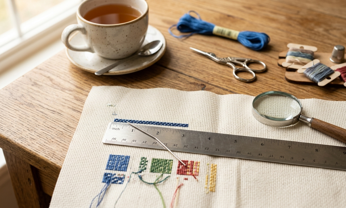
Ruler and blunt needle counting Aida cloth holes at one-inch mark with magnifying glass, fabric count identification method
Keep Reading
Tips for Stitching on Dark Aida Cloth
Once you decide to try black or dark fabric, this guide walks you through exactly how to set yourself up — lighting, hooping, needle choice, and everything else that makes dark cloth stitching manageable and enjoyable.
READ THE GUIDEWhat Do You Need to Cross Stitch?
If fabric color and count are your first decisions, supplies are your second. This beginner-friendly guide covers everything you need to get started the right way.
READ THE GUIDECross Stitch FAQs
Common questions about materials, techniques, and getting started — including the ones about whether Aida is really inferior to evenweave. Spoiler: it is not.
READ THE ARTICLEFrequently Asked Questions
What is the best Aida count for beginners?
14-count is the sweet spot for beginners — it is neither too large nor too small and forgives small tension inconsistencies. The body section on count covers this in detail.
Does fabric background color really affect how cross stitch looks?
Yes, significantly. Dark backgrounds make bright thread colors leap forward; cream softens the look and adds warmth. The color sections above explain exactly how to choose.
Is black Aida hard to stitch on?
It requires a good daylight lamp and sometimes a light box for dense sections, but it is very doable. See the dark fabric section above and the companion dark cloth guide for specifics.
How do I figure out what count my Aida cloth is if there is no label?
Place a ruler on the fabric, use a magnifying glass and blunt needle, and count the holes within one inch — that number is your count. This tip is covered in the count section above.
Is Aida cloth inferior to evenweave or linen?
No. Large fine-art projects stitched on Aida can look just as stately as anything done on evenweave. The closing section addresses this directly.
When should I use cream instead of white Aida?
Cream suits samplers, botanicals, and heritage-style designs that should feel warm and aged. White works better for bright, modern, or graphic designs. The white and cream section has the full breakdown.
-- Tracey Kramer
Founder & Designer, Sunrays Creations Needlearts
Hand-charted designs since 2004 • Marysville, Ohio